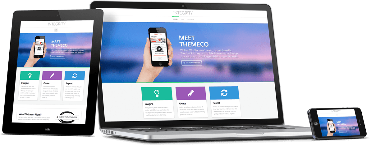

What is a Responsive Website?
A Responsive Website means that the site adapts to the screen size you are viewing it on. We have all seen it before when we are on our phones or tablets, and we click into a un-responsive site and half the page is missing and you cannot click the buttons so you leave. Unfortunately this happens to almost all unresponsive sites, the user see’s it is not working and leaves the page in search of one that is. This costs businesses money, and lost customers, but also affects everyday websites as well, as they have spent a lot of time and effort making a website that people do not use.
But why is it so important?
The last report from 2017 had a massive trend towards Mobile internet browsing instead of PC browsing. On average over 63% of all internet users use their mobile device to surf the web. When we drill down into the age groups, the margin jumps, with people aged between 18 and 30 closer to 80%. So basically if you’re a business targeting the 20-30 year olds with the high disposable income, and your site isn’t responsive, you are losing 80% of your site visit!
Another really interesting statistic is the growing rate at which the PC only visitors are dropping off, in 2017 in Australia the number of mobile phone users rose to 19.4 million but has long past that number now as the number of devices was doubling every 3-4 years as consumers acquire more devices like Smartphones, Tablets and other devices.
Ok it’s very important, so how do I get a responsive website?
Every website we design is Responsive! It’s that easy, we build the functionality into the building blocks of your site. Even as your website grows with you into a social hub, media provider or eCommerce Super Site the responsive building blocks are always there and you’re website looks amazing.